OVERVIEW
AURA Engineering is a respected oil and gas engineering firm specializing in designing midstream storage and transfer facilities. Their original logo carried strong foundational ideas—pipes, tanks, and industrial precision—but the composition felt dated, disjointed and lacked cohesion. Elevantics modernized and refined the mark while preserving its core identity and recognizability.
OBJECTIVE
Our goal was to create a refreshed logo system that felt unified, balanced, and versatile across digital and print applications. We focused on improving structure, readability, and visual harmony while maintaining the brand’s established symbolism.
DESIGN PROCESS
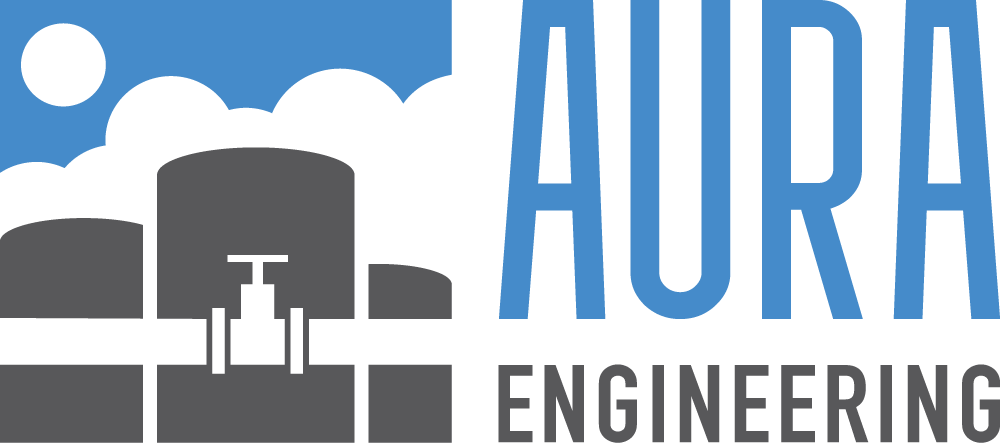
1. Structural Cohesion
We began by bringing all logo elements closer together and aligning them to a shared anchor point. This eliminated the “floating” feel of the previous design and created a stronger, more compact presentation. We stacked and proportionally adjusted the text to achieve better visual balance between the mark and the logotype.
2. Simplified Forms & Improved Readability
Next, we refined the tank and pipe illustration to feel more integrated and purposeful. This involved redraing the pipes n to connect naturally into the tanks, with the design reversed into negative space to add depth and visual interest. Then we introduced some space to separate the overlapping tank forms, improving clarity at smaller sizes.
3. Refined Logotype & Color Palette
Next, we capitalized and adjusted the logotype in proportion to complement the height and weight of the graphic. We reduced the overall palette for a cleaner, more professional look and created both tall and wide configurations for flexible application across signage, digital media, and documentation.
4. Modernized Brand Mark
Finally, we introduced a new logotype with contemporary letterforms that better matched the updated symbol’s precision and engineering character. The result is a cohesive, modern identity that reflects AURA’s expertise and innovation in industrial design and engineering.
OUTCOME
The refreshed AURA Engineering logo now presents a unified, professional image that feels engineered with the same precision the company brings to every project. It maintains brand heritage while aligning the visual identity with the firm’s forward-focused vision.