
OBJECTIVE
Comb and Take It, a salon founded by a proud hispanic Texas woman, wanted a brand identity that was as bold and independent as the state itself. The goal was to create a visual system that stood out in the beauty industry while also paying homage to the salon’s roots and personality.
Our Approach
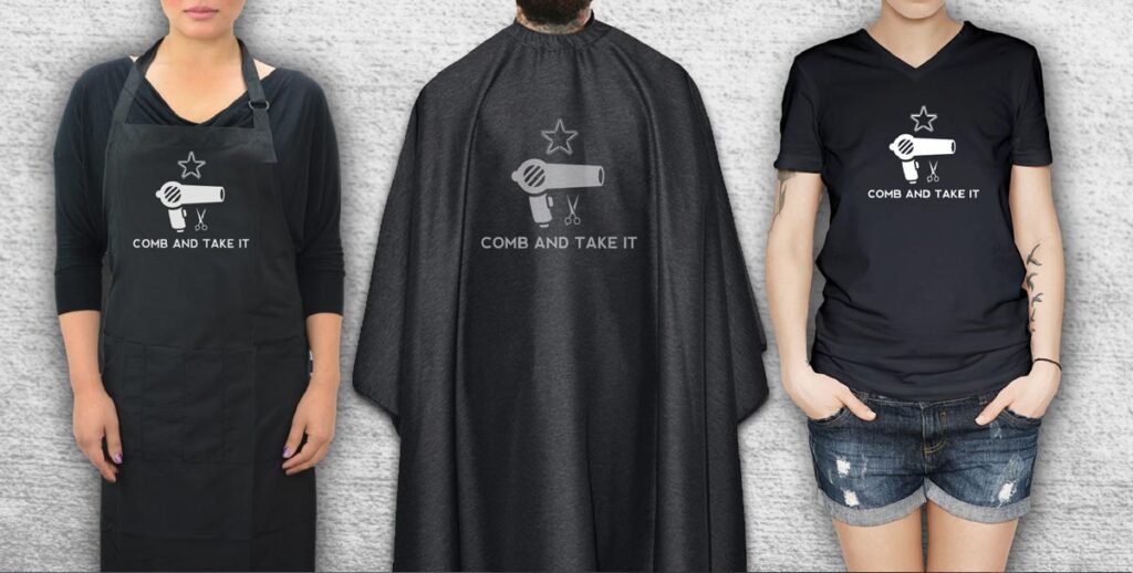
Drawing inspiration from the historic “Come and Take It” flag, we developed a name and logo that cleverly play on this iconic Texas symbol. The logo imagery reimagines the flag’s message with a beauty industry twist—replacing the cannon with a blowdryer and a lone star made of combs—striking a balance between strength, fashion, and local pride.
To support the logo, we crafted a monochromatic palette of black and greys for a sleek, timeless look, and paired Nevis Bold with Raleway Light to create a typography system that is both commanding and approachable.
Brand Assets
The brand package included:
- Business and appointment card designs on premium matte stock, giving the brand a polished, professional feel.
- A logo system that pays homage to Texas heritage while creating a memorable salon identity.
- A typography and color guide designed for versatility across digital and print.
The Result
The finished brand identity captures the spirit of Texas independence while delivering a clean, modern aesthetic for the salon industry. With its clever nod to history and its bold visual presence, Comb and Take It now has a brand that embodies both its owner’s pride and its distinctive place in the market.
