OBJECTIVE
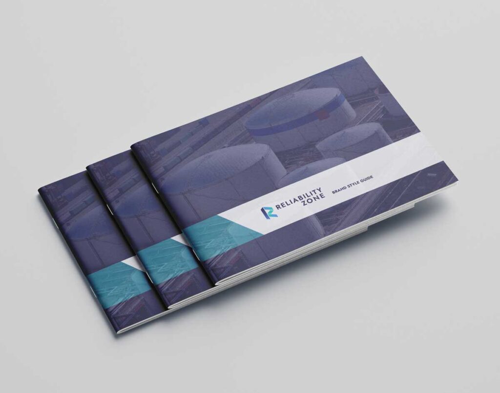
Reliability Zone approached Elevantics to create a professional, modern brand identity that would capture their core values of trust, dependability, and innovation in the oil and gas industry. The goal was to establish a strong visual foundation that would scale across digital and print applications while differentiating the company in a competitive market.
OUR APPROACH
We began with discovery sessions to understand Reliability Zone’s mission, audience, and positioning. From there, our design team explored concepts that blended strength and precision with a clean, contemporary aesthetic. The result was a bold, geometric mark paired with a clear, confident wordmark.
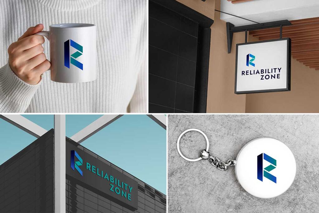
LOGO DESIGN
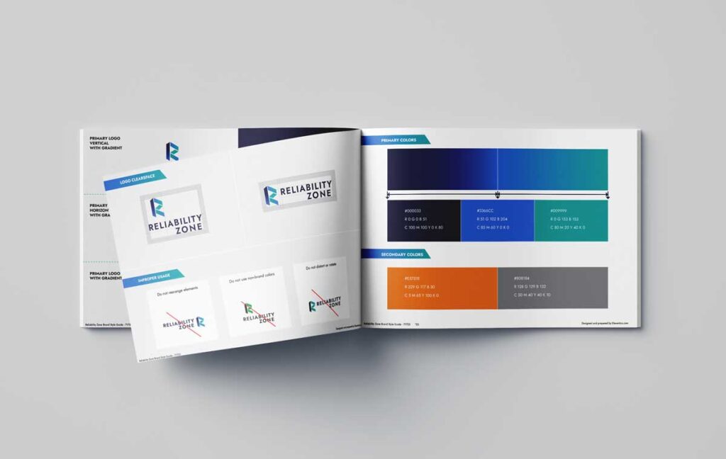
The final logo features a stylized “R” constructed from angular, interlocking shapes in a gradient of deep blue to teal. This design conveys both stability and forward momentum, symbolizing Reliability Zone’s role as a trusted partner guiding clients toward dependable solutions. The modern typography complements the icon, balancing authority with approachability.
BRAND IDENTITY SYSTEM
Alongside the logo, we developed a comprehensive brand package including color palettes, typography standards, and usage guidelines. These assets ensure consistency across all touchpoints—from websites and presentations to marketing materials and signage. The color scheme of bold blues and greens reinforces the values of trust, reliability, and growth.
THE RESULT
Reliability Zone now has a distinctive, professional identity that positions them as a dependable leader in their industry. The brand system not only strengthens recognition but also provides the flexibility to scale as the company grows and expands its reach.